The Oyster brief
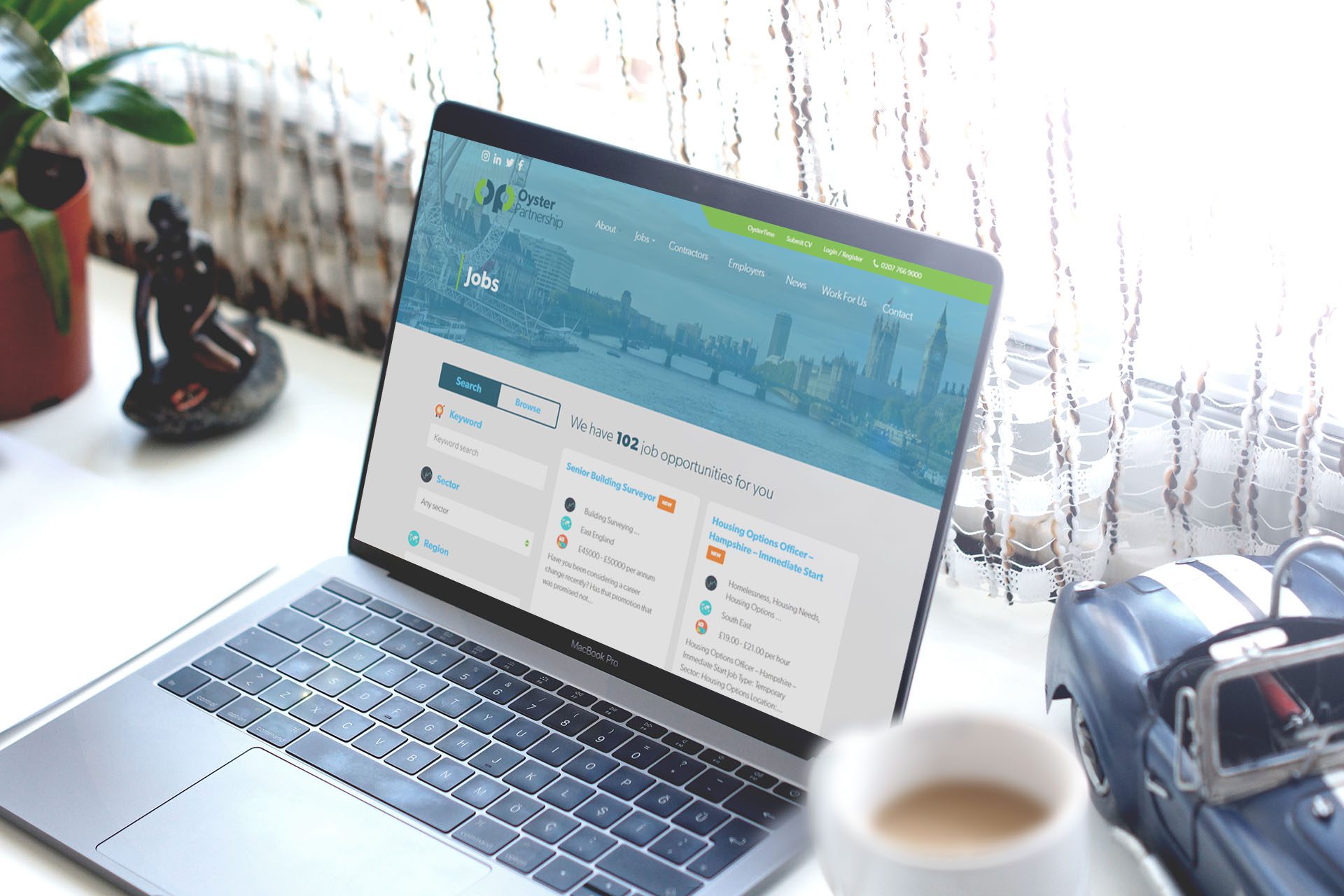
It’s time to modernise. Oyster had a clear goal in mind with the new site and that was style. We had already worked with Oyster on their previous site a number of years ago so we already had a strong udnerstanding of Oyster and how they like to work.
The site needed to be stripped back and simplified, previously there was a lot of content and it wasn’t very engaging for the user. It was important that the job searching was much more accessible on mobile devices and that users could upload their CV, no matter what device they are on.
In addition to this, Oyster wanted to update their logo and branding to help compliment the new site. With all of this we also procuded a brochure for Oyster with a inset sleeve for documentation and business cards.
What we did for Oyster
Moving Oyster to our new system was the first point of call. Whilst this was underway the design team worked with Oyster to create a updated logo and branding guidelines, which was to be used on all marketing materials and throughout the office.
One thing we focused on more than anything was the user journey when it came to job searching. Oyster had a few clunky and long winded set of search peramiters previously, so stripping this back to it’s most simple form allows users to quickly highlight what jobs are most important to them. On top of this we wanted to be sure that candidates could register their interest for future jobs and be able to recieve automatic email alerts based on new and relevent jobs.


